a large healthcare
community
- ● Branding & Identity
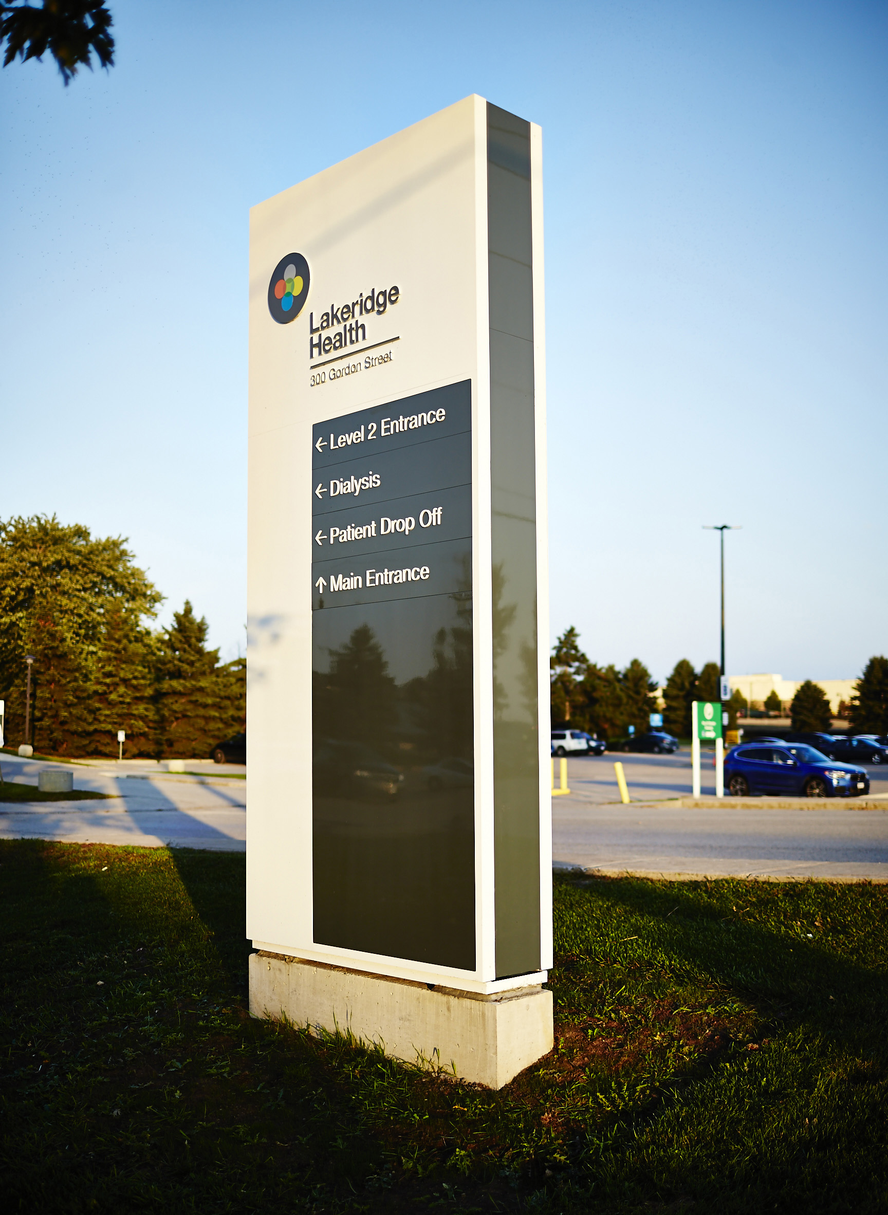
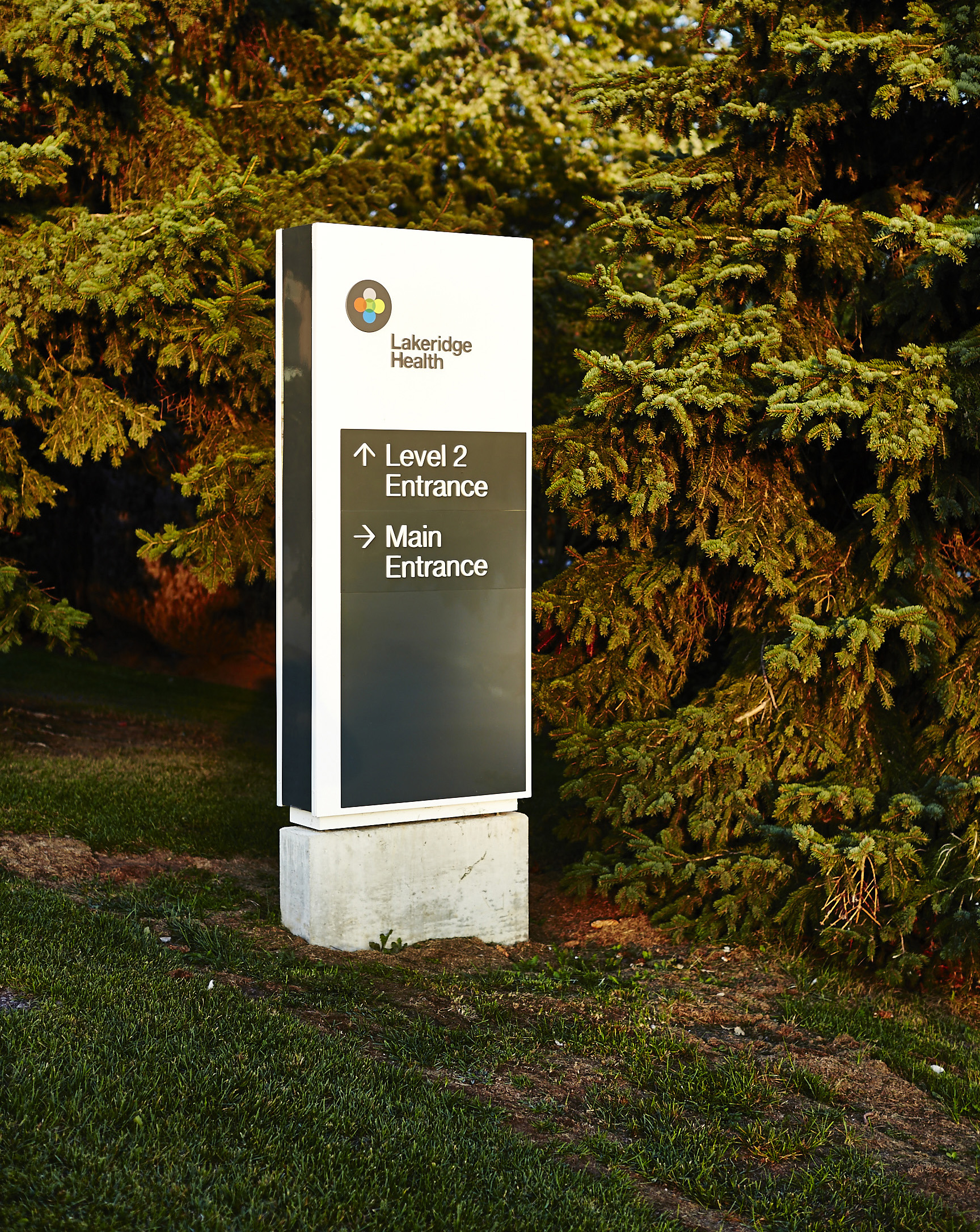
- ● Way-finding
- ● Marketing Collateral
- ● Fundraising Event Naming
- ● Event Identity
- ● Social Media
- ● Event Collateral
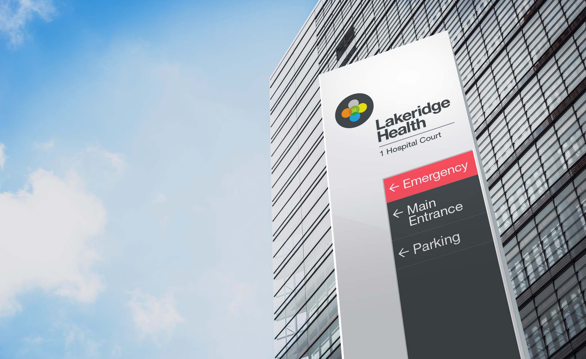
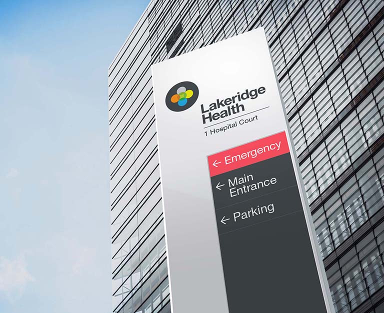
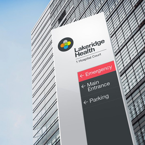
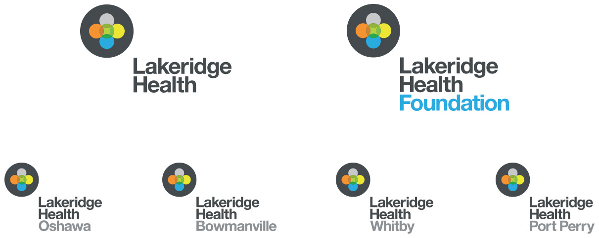
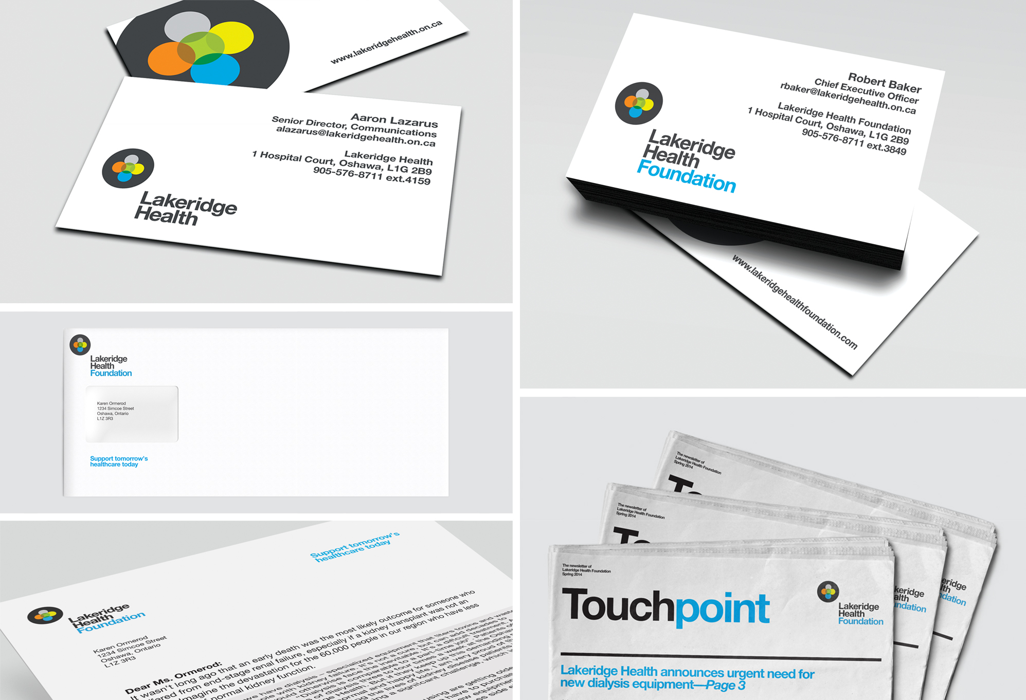
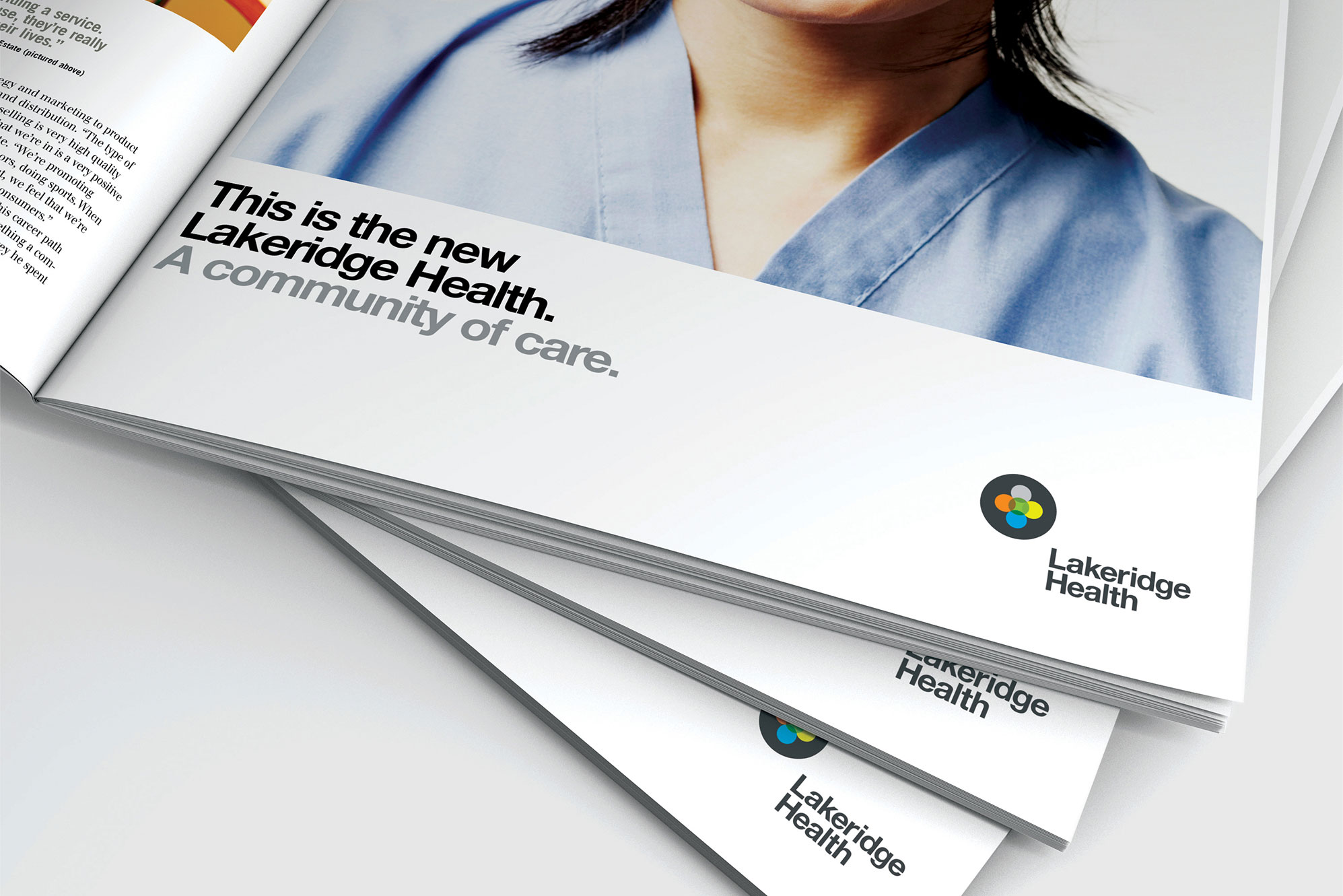
Lakeridge Health is one of the largest regional healthcare systems in Ontario. It is the result of a merger of four hospitals and 12 health care clinics. The process of rebranding brought unity to an unwieldy federation of communities and cultures.
We started by mapping the social and organizational terrain—gathering insights that would lead to more targeted communications and a design strategy. Our challenge was to develop a corporate identity that illustrated both the intricacy of Lakeridge’s corporate structure and the common bond between the organization’s various parts. Our work also provided Lakeridge leadership a map of its own complex cultural landscape as it moved forward.
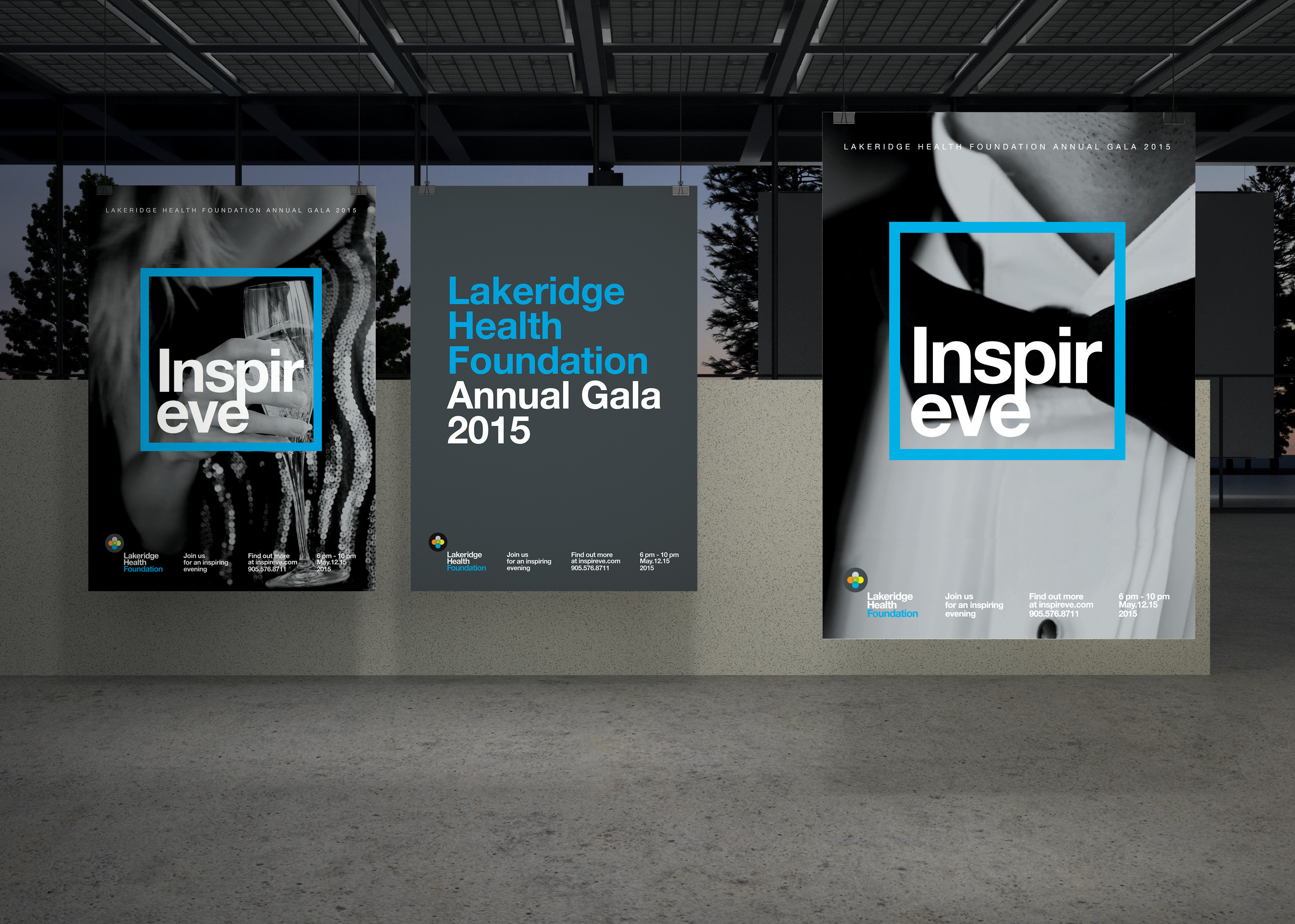
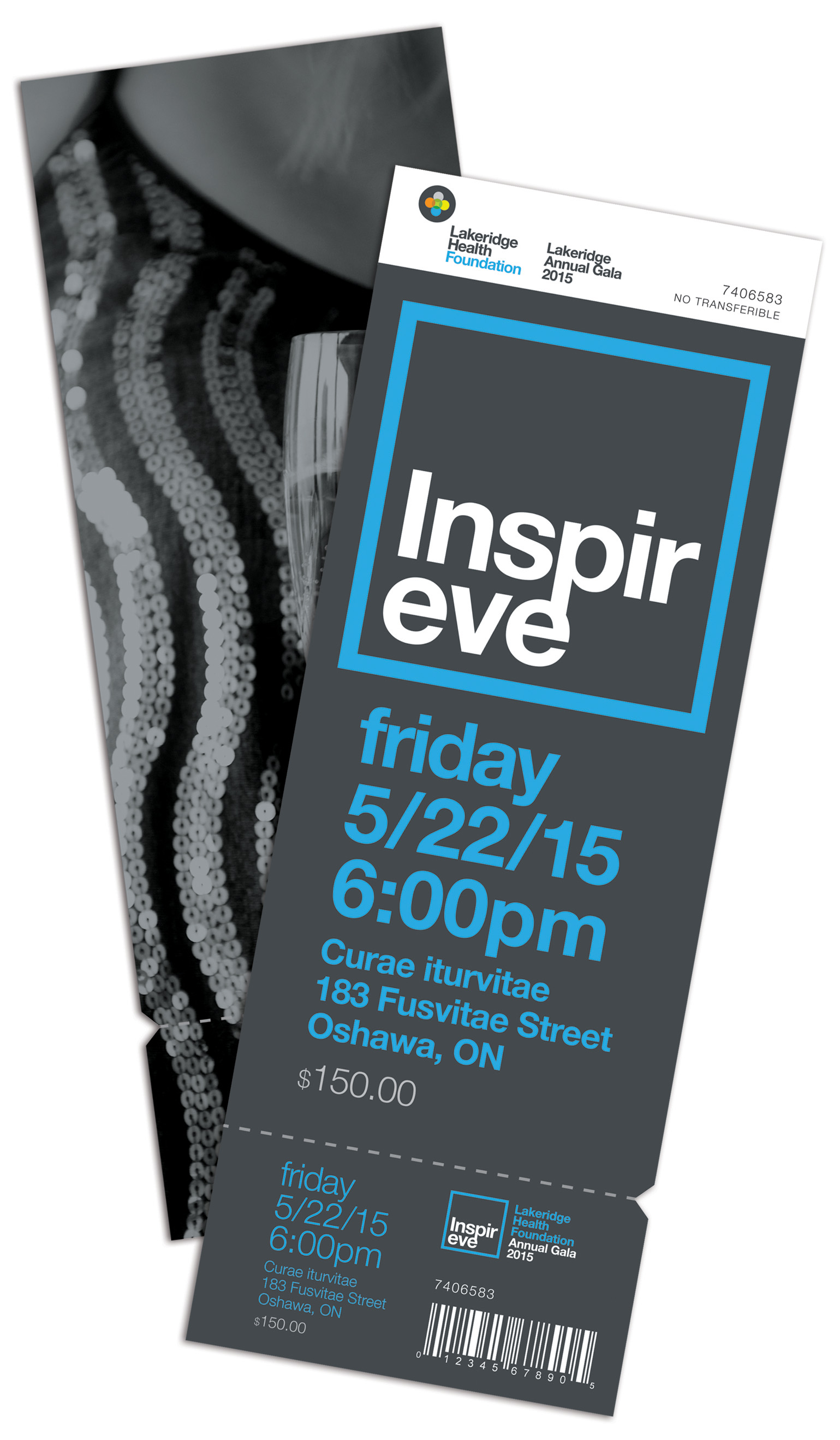
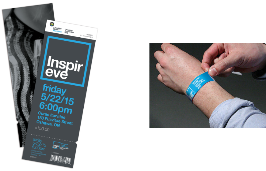
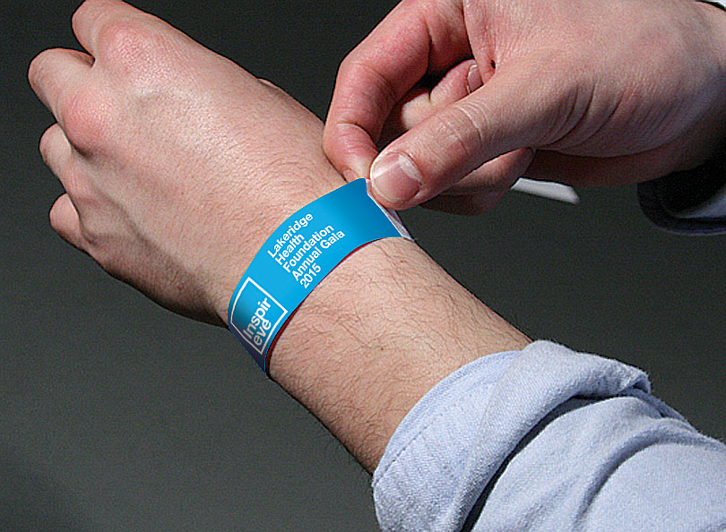
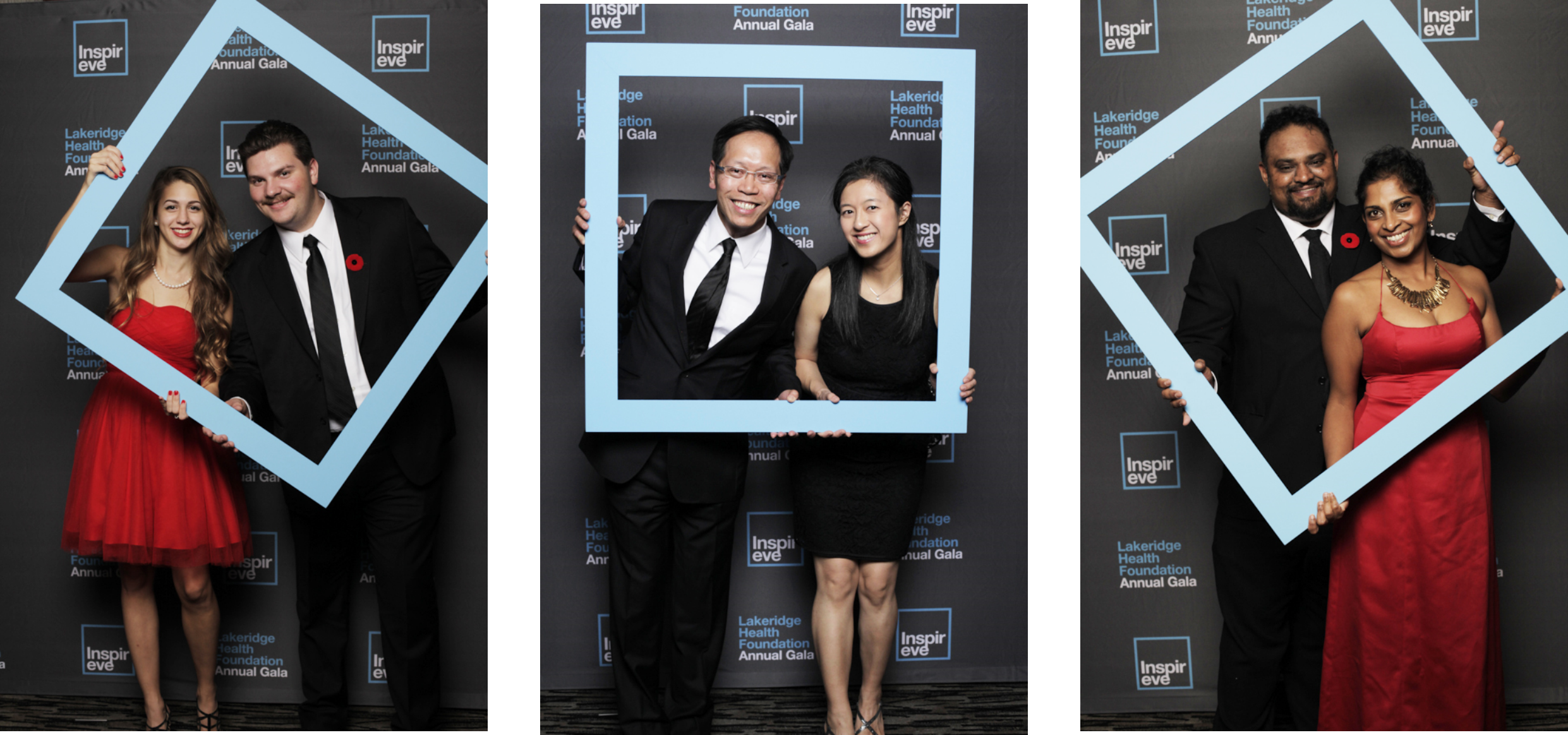
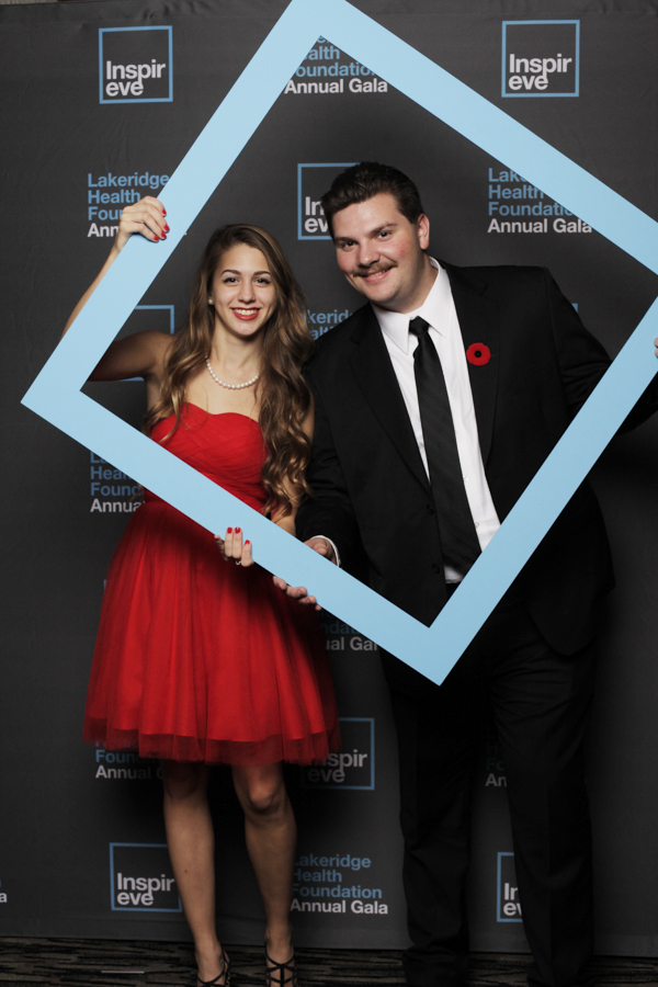
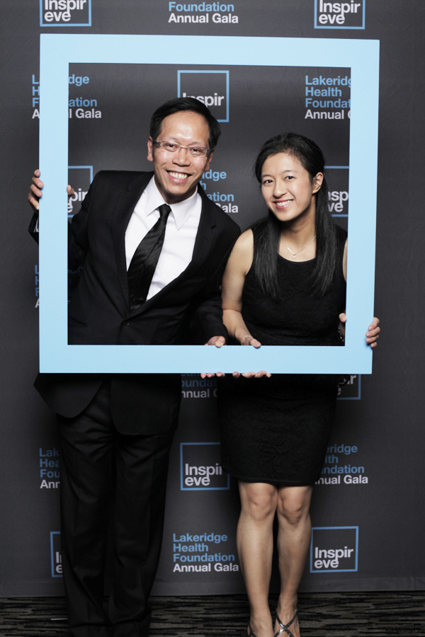
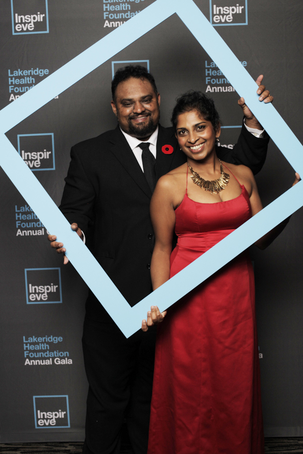
Reinvigorating an event brand—The Lakeridge Health Foundation orchestrates a number of fundraising events throughout the year. The Lakeridge Hospital Annual Gala is the cardinal event. It is organized around a different theme every year—resulting in a different look and style to support each successive theme. Unfortunately, this practice created market confusion and undermined any brand equity. We deliberately broke with that tradition. We worked with the Foundation to develop Inspireve—a new event brand. Inspireve offered the Foundation a clean slate and an opportunity to raise the bar and reinvent the event experience. Along with the event brand, Aegis also developed a range of branded communications. ⬤